Introduction
What is BCTA?
Bay City Tennis Association is a non-profit known for launching a decade-long initiative to bring tennis courts and services to Bay City, Michigan.
This 2 month project marked my first experience incorporating SEO tactics and working with a website builder.


Deliverables
Challenges
How can I...
Write targeted content to bring attention to the website?
Validate navigation and layout that leads the visitor to essential information?
Create an appropriate visual theme based on the business’ main clients?
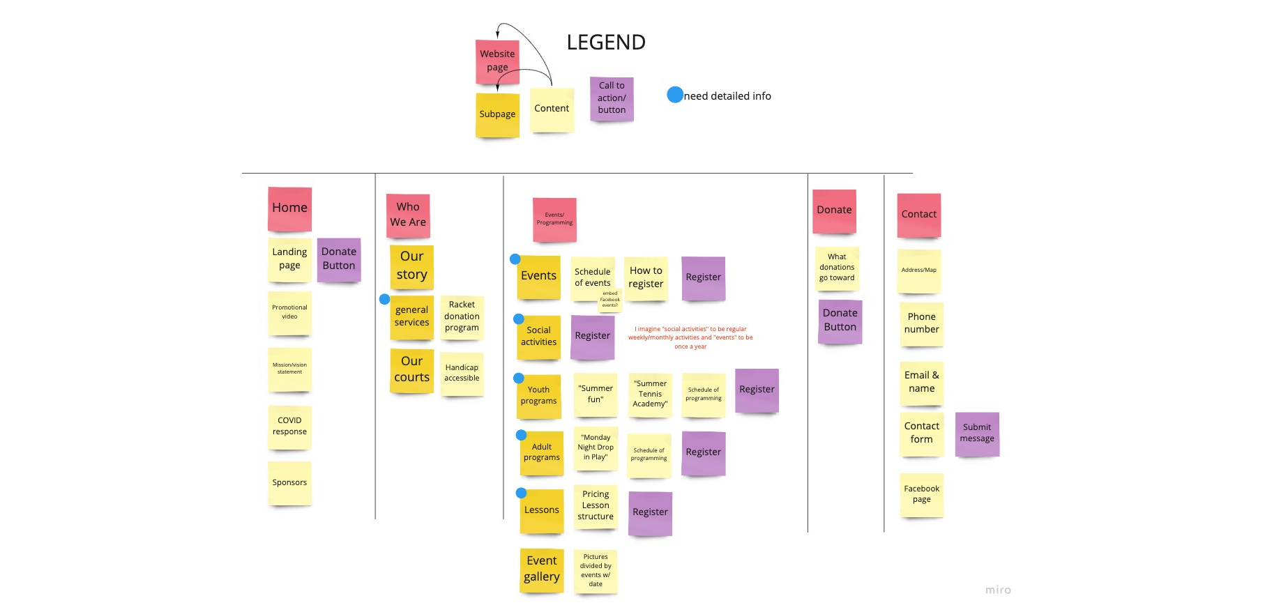
New structure, new content Navigation and Copywriting
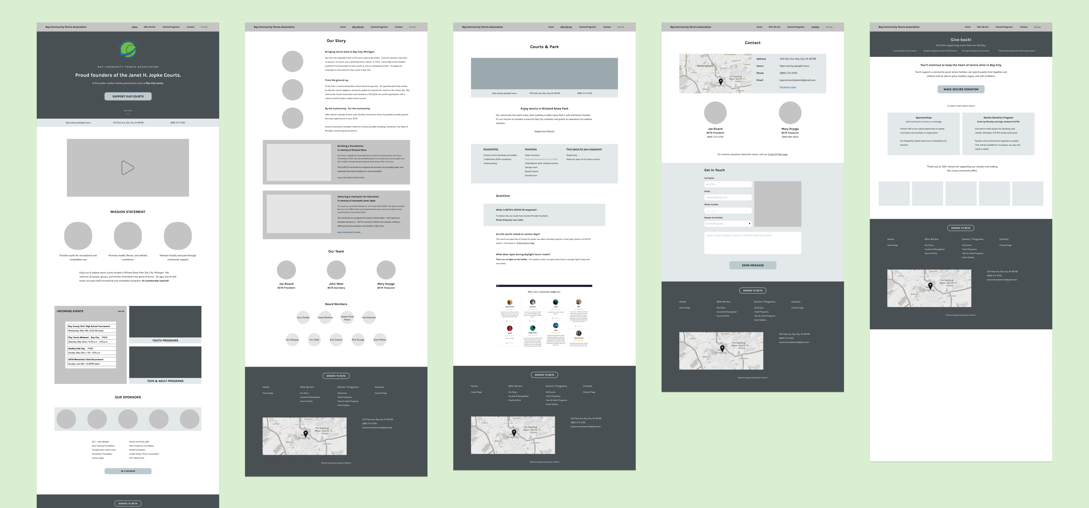
Initial navigation
I organized possible content from the old website and what the client requested. Using a bottom-up approach I grouped similar information, and the 5 main sections became: Home, Who We Are, Events/Programming, Donate, and Contact
Challenge Point
Write targeted content to bring attention to the website?
Reddit Finds
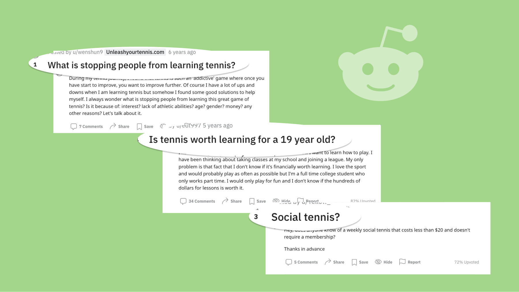
Common patterns I found for tennis players’ motivations included:
- Finding friends
- Want an inexpensive, recreational activity
- Want to jump in at any skill level
Writing
The writing process was centered around focus points highlighting the organization mission statement, story, and uniqueness.
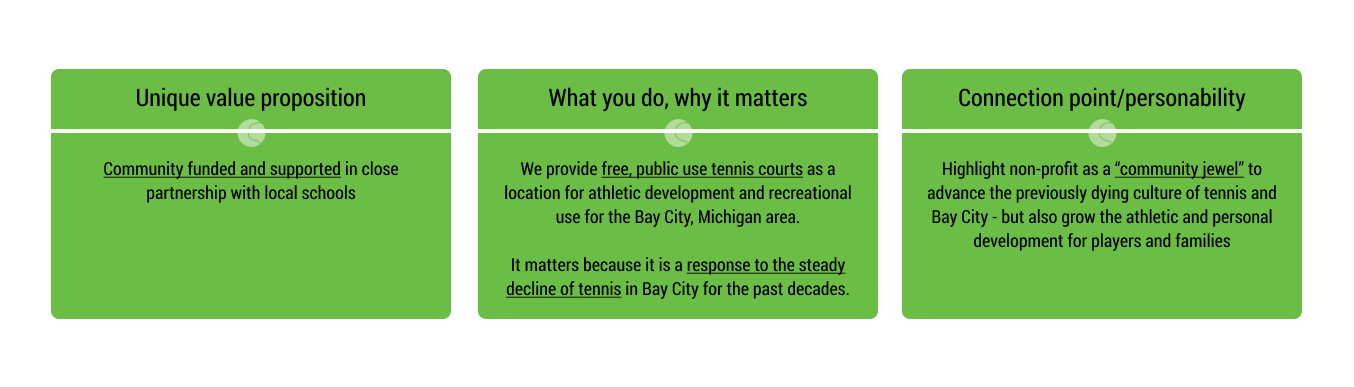
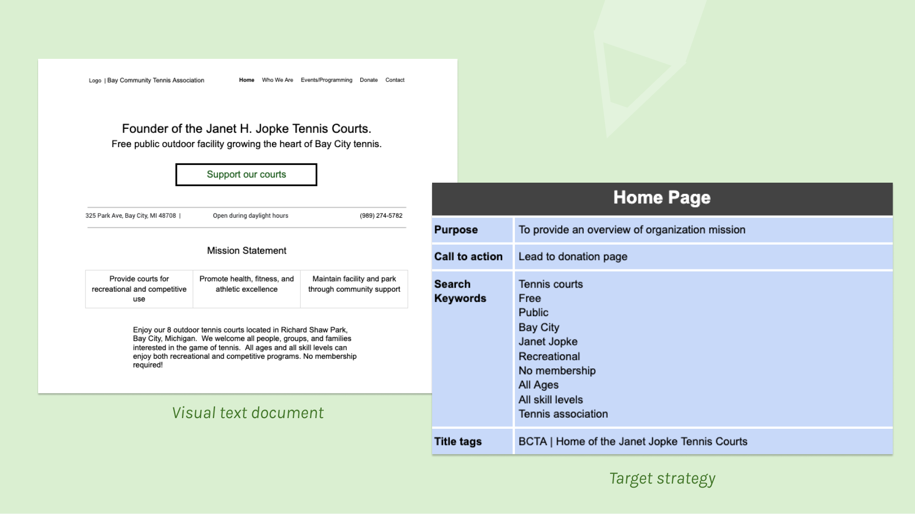
The key takeaway was to highlight Bay City Tennis as built by the community, for the community. I created a comprehensive visual-text document in which each page had a goal, and target keywords.
Practicing Intentionality Midfis
Challenge Point
Validate navigation and layout that leads the visitor to essential information?
User Tasks
Changes
| # | Original design | Feedback | Change |
|---|---|---|---|
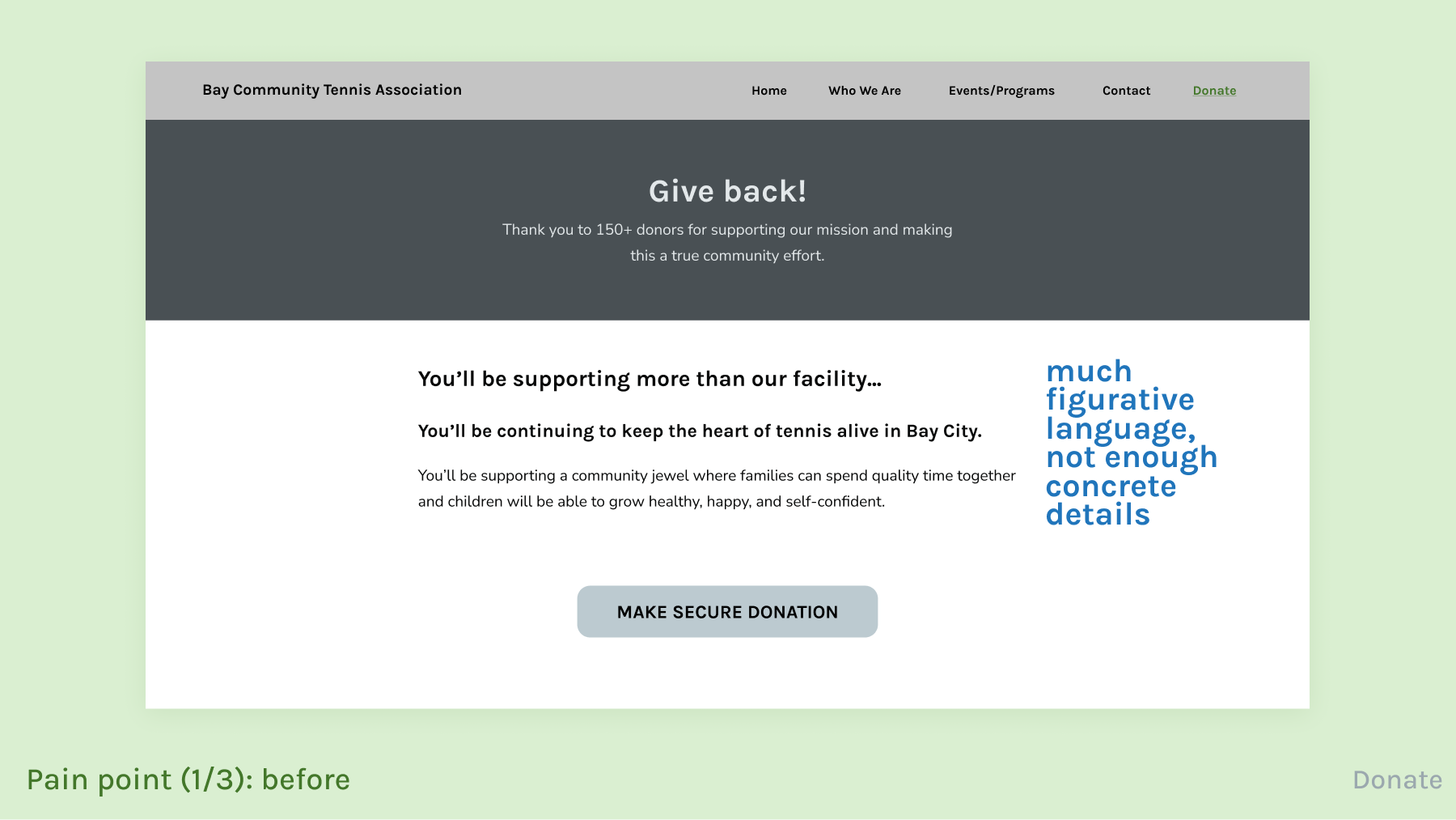
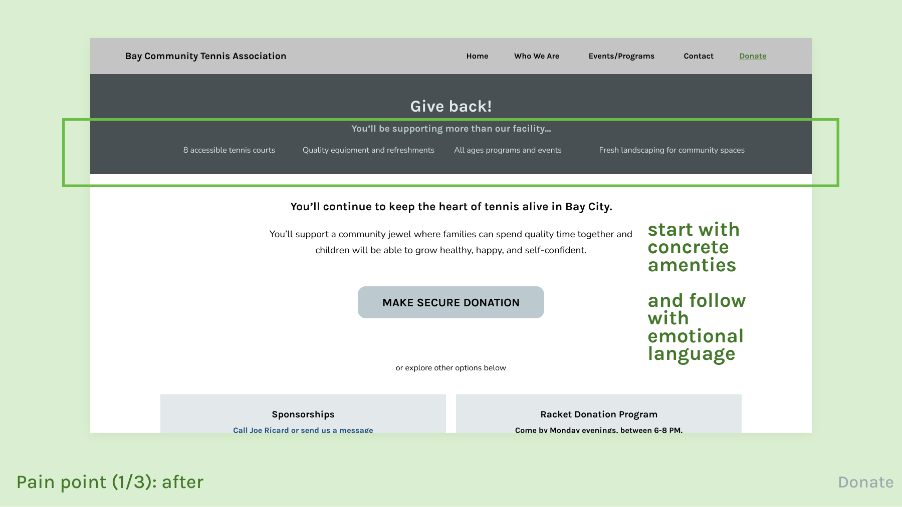
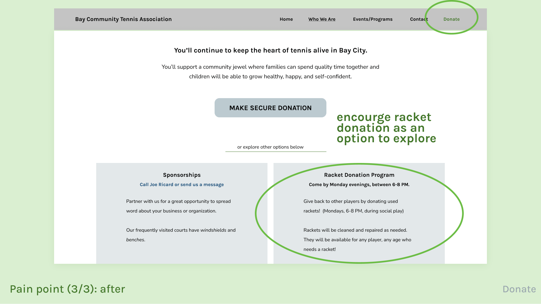
| 1 | The Donate page has a header that says “Give back!” and thanks donors. | 4 of 5 felt unsure about where their money would go if they donated and wanted either written or visual confirmation. | Kept “Give back!” but added that money would go towards the facility and listed 4 tangible amenities. |
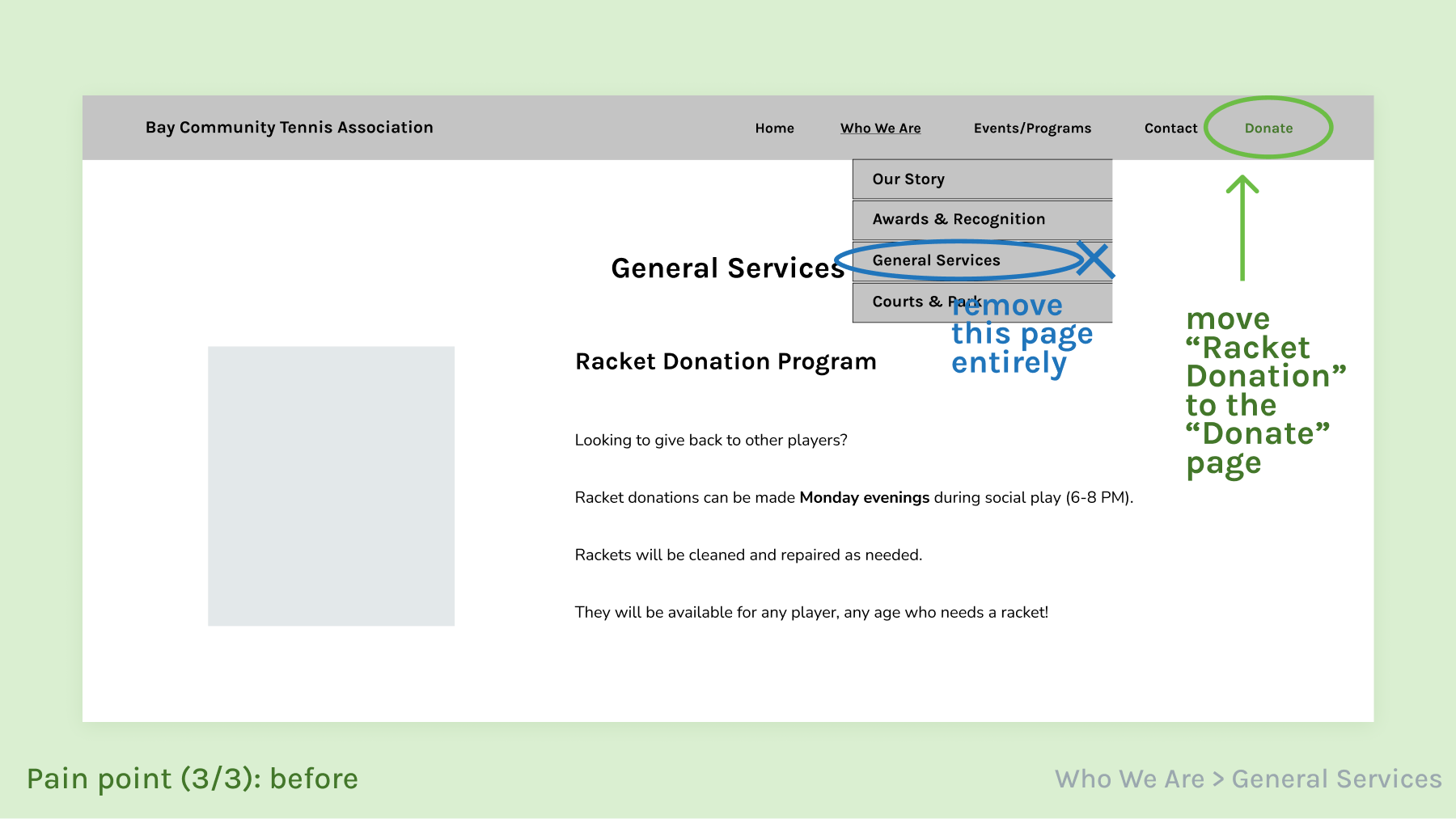
| 2 | The “Racket Donation Program” was the only information part of the General Services page. | 3 of 5 got lost because they expected to see equipment donation in the Donate page. Most likely due to the shared language. | Removed the General Services page entirely, and moved information to match participants’ mental model |
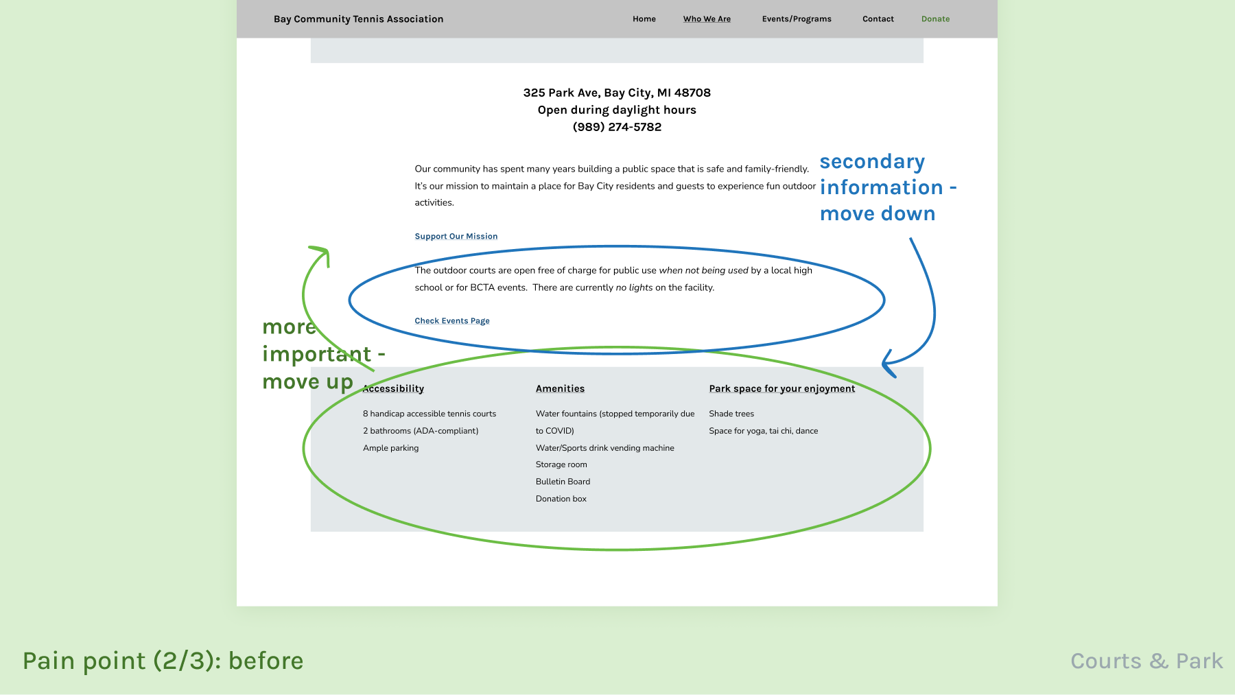
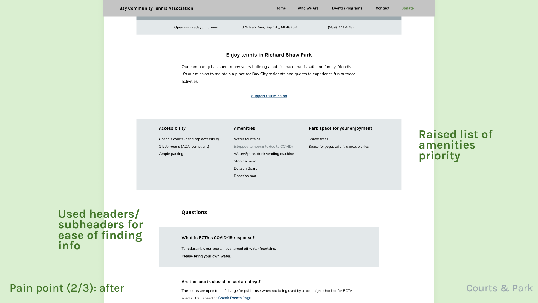
| 3 | The Courts and Park page originally had a paragraph about court usage that was prioritized over the court features and amenities. | 2 of 5 took longer to find a quick list of features about the courts and expected it to have more priority. | Moved the list of features and amenities up to improve priority.
Reformatted info about court availability into an FAQ so easier to scan. |
Developing the look Visual design
Overall look
| Request | Approach |
|---|---|
| Family-friendly | Used photography of players of all ages. Included playful vector illustrations. |
| Our colors to be our colors | Use the logo green and blue to simply create tints and shades. This produced a cohesive look for text, buttons, and background dividers. Since there was not a third color for accent, I used green sparingly for major call-to-actions. |
| Pleasant | Focus on making information easy to explore, with much whitespace and without sharp contrast in color or typography. |
| Inviting | Cooler and more neutral tones. Asked for staff to provide pictures to be personable. Many community photos. |
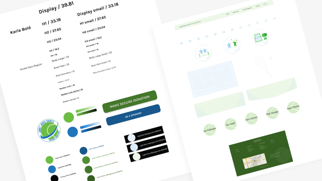
Typography
The desktop and mobile sites follow a minor-third type scale. To me this allowed headers to pair closely with body text without making the headers pop out too much.
To avoid introducing many font sizes on one screen, I also used font weight and color to distinguish hierarchy between elements of the same size.
Tennis imagery
To mimic both a tennis ball and tennis court, various patterns throughout the website use stripes and lines.
Other Resources
Event Widget
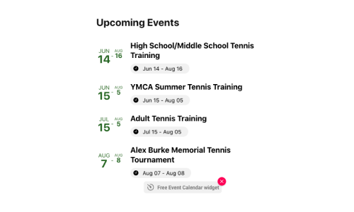
I used Elfsight's Event Widget so my client could easily update their events - no coding required.
Testimonials
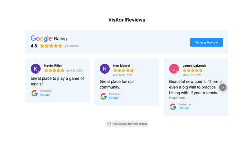
I used Elfsight's Google Reviews widget to highlight positive reviews and features of the courts.
Reflection
Writing intentionally
This project helped me practice writing intentionally. Not only did I have to write concisely for length and readability, I had to write from a business standpoint and consider marketability.
Understand your platform’s restraints
In the interest of time and money, I worked over the existing site on Wix. With Wix, I was not able to fully implement my design.
This affected minor visual details like not being able to add gradients.
But this greatly affected the largest and most important call to action, as we had to default to the Paypal design on Wix.