Introduction
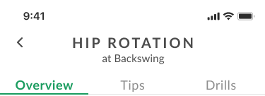
What is Golf AI?
A mobile-app startup based in San Diego, CA using 3D pose-estimation technology to analyze and improve golf swings.
App store promo video created by Me.
As 1 of 2 visual designers, I was responsible for the visual identity of the company. For the app, we received midfis from the UX team and developed 11 hifis to handoff to the developers. I also used video production and motion design to create both in-app and promotional content.


Challenges
How can we...
Develop the company’s brand?
Create a consistent and efficient design system?
Improve designer-development handoff?
Brand Major Project 1 of 2
Challenge Point 1
How can we further develop the company’s brand?
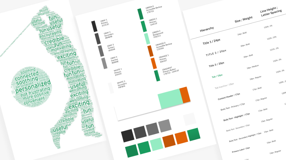
Buzzwords
Both the UX team and users wanted: a soothing and encouraging coaching experience with a balance of fun/credibility.
This translates to demonstrative/engaging visuals and helpful copy, without the stress of information overload.
Colors
After researching color psychology, our winning colors were: green for growth and orange for confidence.
The specific shades were chosen with respect to a contrast-checker.
Our monochrome palette for text (primary, secondary, tertiary) referenced Adobe.
Typography
We continued to use the apps’s existing font, Lato. We determined line-heights for box sizes to follow our newly chosen 8pt grid system.
We also wrote use cases for developer reference.
This was a continuously developing process as the number of screens grew.
Building Components Major Project 2 of 2
Foundation
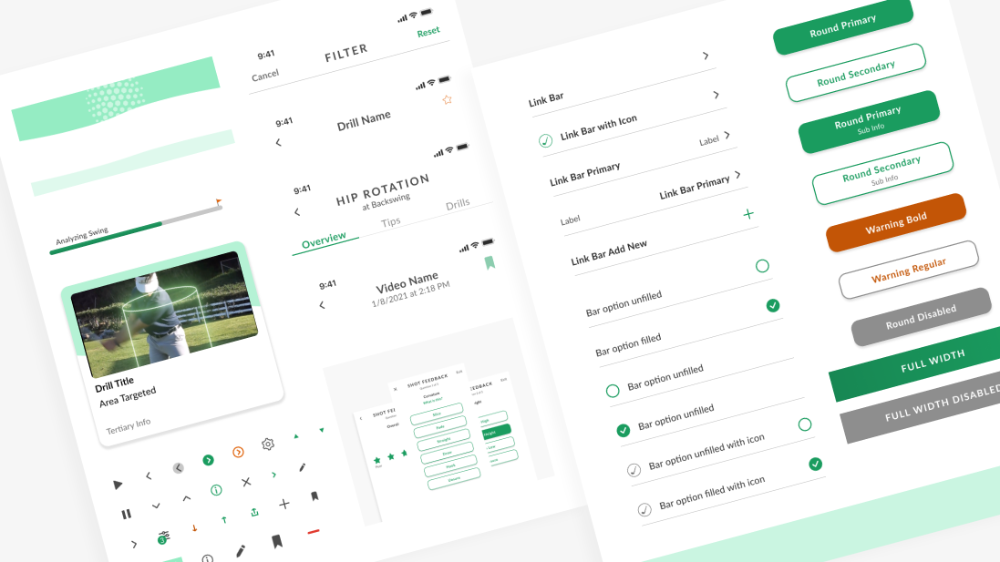
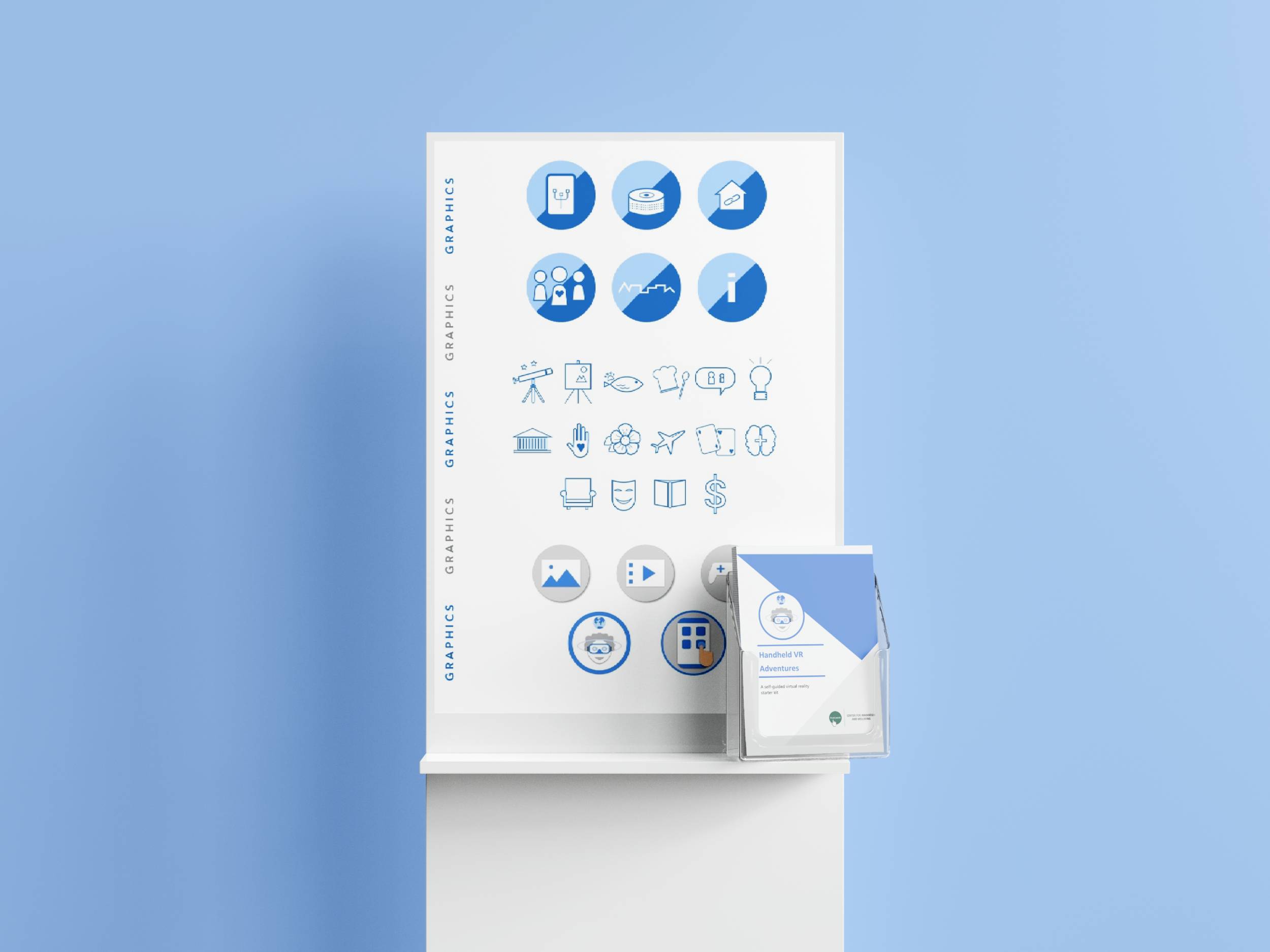
Our first step was to build standard components (with inspo from Airbnb's system).
- Navigation bar
- Buttons
- Form elements
We added app-specific components along the way, based on what each screen needed.
- Action plan cards
- Progress bar (with golf visuals)
- Fixed headers with tabs
Overall Visual Style
We created the ideal "soothing and lightweight experience" through:
- Limiting boldness
- Using green mainly for active states and accent orange sparingly
- Using 2px strokes for actionability and active states
- Using light gray box shadows as a softer grouping/separator style

Challenge Point 2
How can we create a consistent and efficient design system?
Techniques
Responsive Layouts
Giving each section a proportional height helped us responsively center content without fixed pixels.
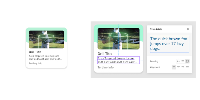
Box Sizing
We determined character counts for each component to have sufficient space for info.
Nested Components
Following the concept of atomic components, we wanted to make consistent and quick widespread changes.
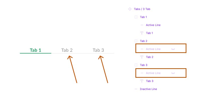
Makeshift Variants
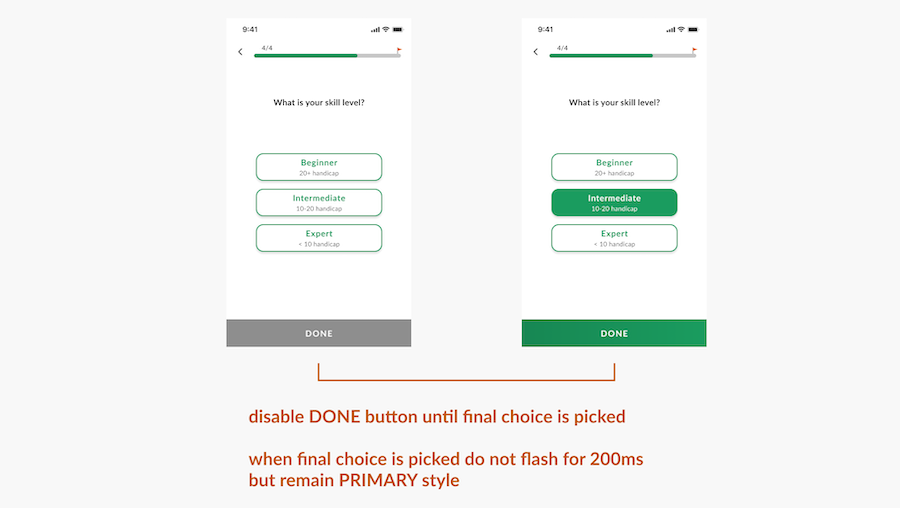
Before Figma released variants (Nov. 2020), we used layer visibility to toggle active states for components.
Application to Screens Hi-Fi Process
Learning Points
Scaling Down
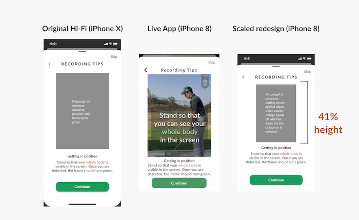
Our first handoffs using iPhone X artboards had squished content. I pushed for us to start smaller (esp. if everything fit on one page). From that point on, all of our main references were for iPhone 8.
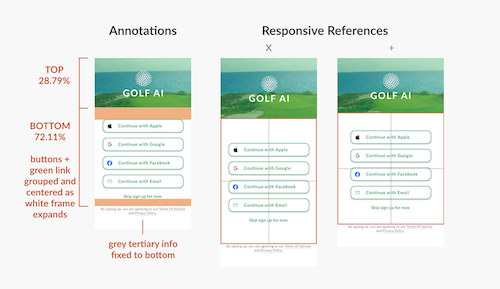
Vertical Responsiveness (Login Screen)
I was stuck calculating margins (in orange) that looked balanced for all devices. A developer suggested a more flexible approach: group content to dynamically center. I learned to not fixate on numbers and rely on Figma’s smart constraints.
Validating Designs (User Tests)
Before user tests, we gave our UX Researcher interactive prototypes. Our questions were often visual focused, focusing on how users...
- understand what iconography represents
- interpret interactive elements based on boldness/size/color
- interpret their golf skill progress or statistics based on colors
- decide what to do (based on the structure/hierarchy of the screen)
- feel about the mood
Note: Over Zoom (due to COVID-19), our UXR controlled the mouse for Figma prototypes and we relied on verbal answers. We had to keep in mind not having accurate accounts of scrolling and tapping.
Development Handoff
Problem point 3
How can we improve designer-development handoff?
According to the previous UX team, difficulties communicating resulted in inconsistent spacing in the app. My HTML/CSS background helped us share language for more accurate builds.
We had pre-development meetings for devs to validate the structural logic of our hifis. For any questions about feasibility, we tried to save effort and address them before finishing mockups. In 3 weeks, we were consistently presenting the following info:
Zeplin
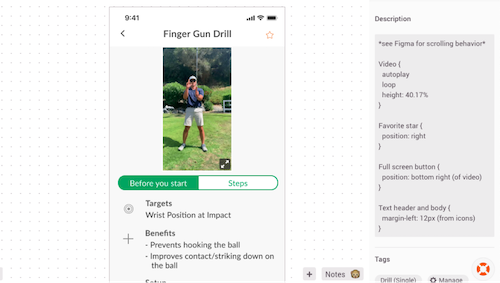
Pseudocode
Previously, handoff for Zeplin didn’t include descriptions. I wrote CSS-based syntax for element behavior (finding the best margin, positioning, or sizing rules for all devices).
Figma
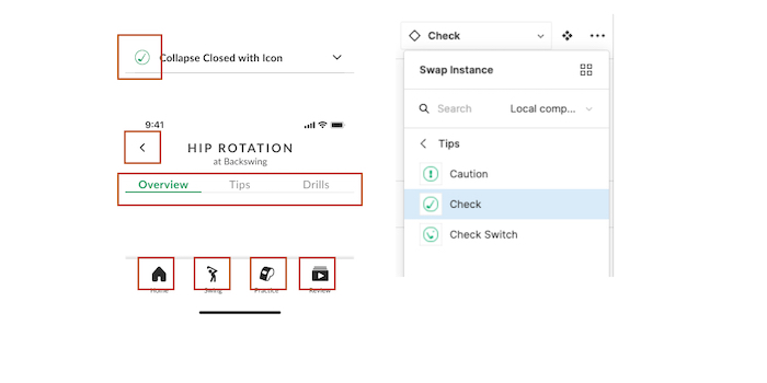
Interaction Annotations
We took advantage of the artboard overview to create annotations for microinteractions and how screens connected.
This is also where we placed iPhone X and 6/7/8+ appearances and prototypes for the devs to reference.
Different Hats Motion graphics, marketing, etc.
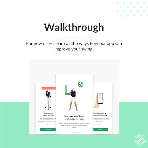
Working in a start-up environment I was able to practice self-delegation and flexibility. Whenever our hi-fi work was stalled, I had opportunities to promote the app in other ways: video production and motion design.
Reflection
Our impact
App store impressions
(from 8k to 46k)
App store views
(from 900 to 2000)
Website sessions
(from 400 to 1500)
Areas to Grow
Designing practically
I had to challenge myself to be practical - flexible and responsive - over being pixel-perfect.
I also had to challenge my discomfort presenting early-stage drafts that weren't fully fleshed out yet. Going forward, I want to become comfortable at this stage so I can focus on UX needs and visual design equally.
Being a cross-functional team player
Our handoff process was trial-and-error that never reached 100% perfection. I realize that our 3 developers each have their own working styles (coding or organization). To work smarter, it's best to be on the same page about what assets each team needs and cut out unneeded details.
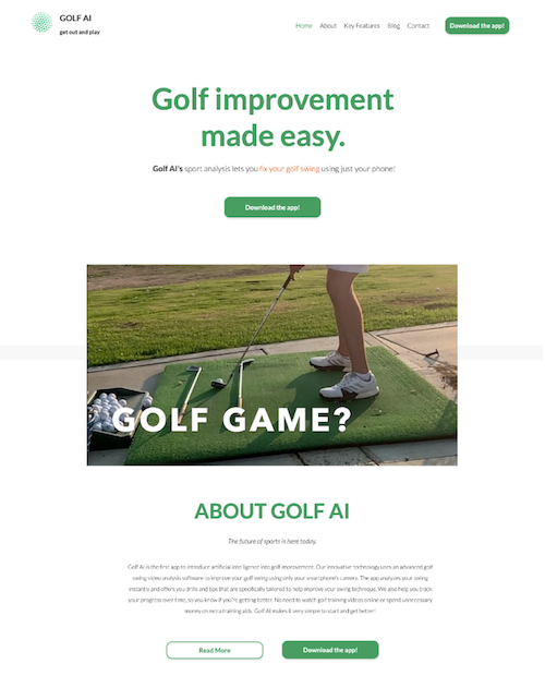
For more information, visit Golf AI's website ↗