Introduction
What is Front Porch?
Front Porch is a not-for-profit family of retirement home communities, using life-improving technologies to address the changing needs of older adults.
The primary goal of my internship was to design content to help residents understand the use and benefits of these technologies.
Challenges
How can I...
Create documents that are both informational and aesthetically appealing?
Best design instructions for products I'm not an expert with?
Keep in mind accessibility and different tech fluencies?
Main roles
Structure and write instructions for resource guides and manuals

Create original illustrations and graphics
Considering use cases to generate UX copy
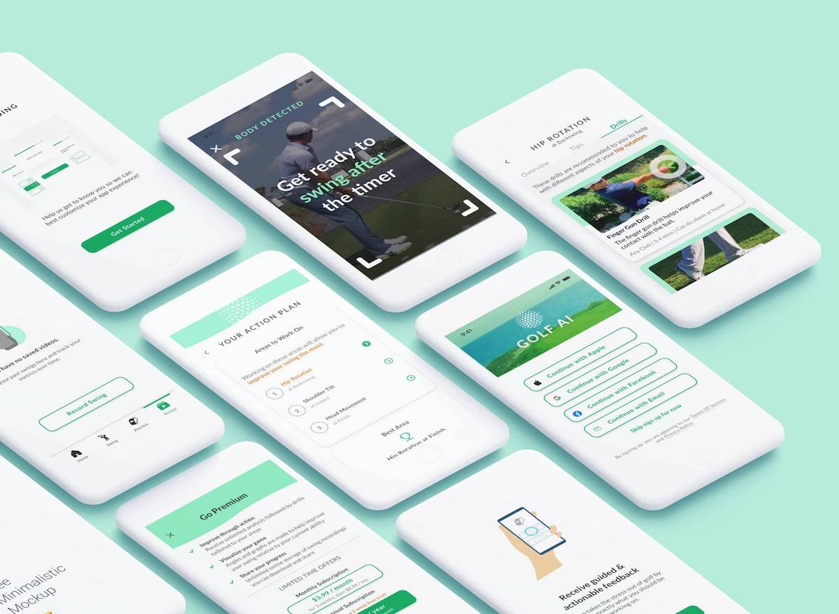
K4 Community App Major Project 1 of 3
Product Info
Resident Side
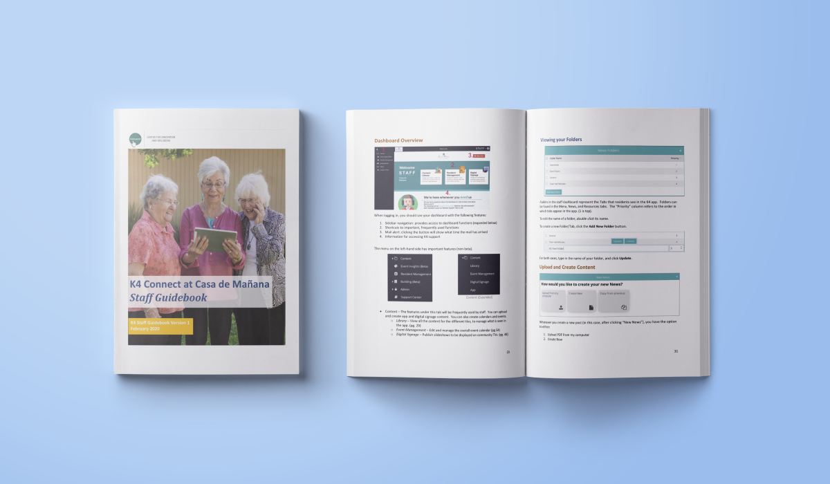
The K4 Community app provides residents with daily info on events, dining, etc.
Staff Side
The K4 Dashboard is an internal interface for staff to populate the app’s content.
My Role
I created written instructions with mockups and annotations for both audiences to know how to use K4 products.
Challenges
After observing difficulties during staff training sessions, I learned not to assume things would be easy to use.
It took effort to walkthrough each interface component in detail, but I learned how to cut text and be intentional with guiding the reader.
Problem Point 1
How can I best design instructions for products I'm not an expert with?
Strategies
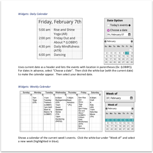
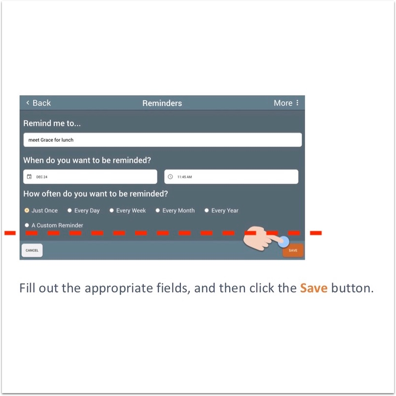
I used the apps in a role-playing manner, similar to how I might I give someone a task for a usability test. Some interactive scenarios might be:
- A staff member wants to enter a new resident in the Dashboard’s Resident Management system
- A resident might want to view and sort different upcoming events
This helped me better understand a task flow and what to highlight on the interface.
Relatable language
For the events calendar tutorial, I filled in community terms, practices and locations instead of using lorem ipsum.
Save space
I used Sketch to splice areas with blank sections, to reduce image height.and save space.
Avoid redundancy
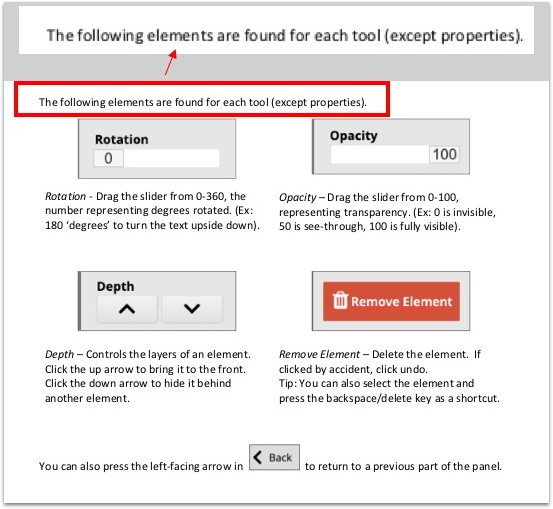
For the slideshow tutorial, I wrote an introductory section for repeating properties found in each tool, so I wouldn’t have to define it each time.
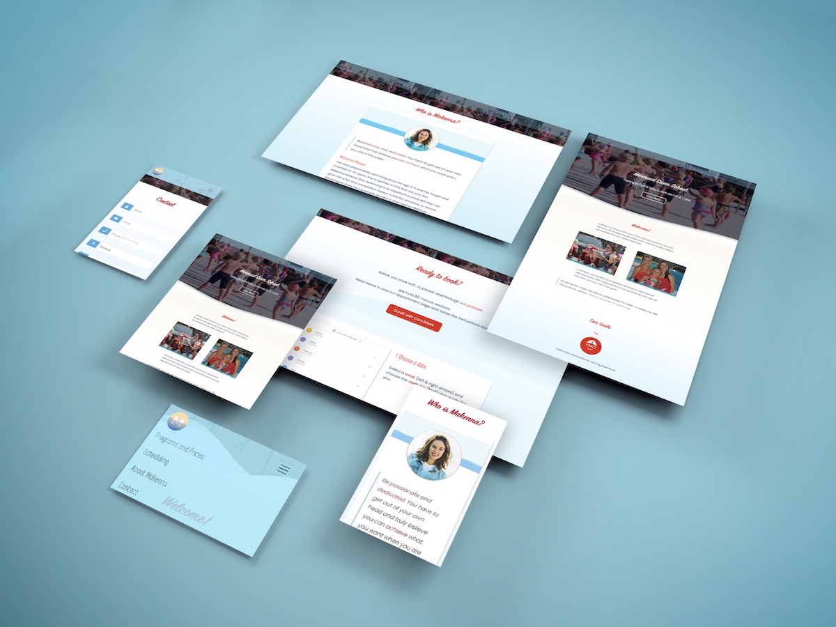
COVID-19 Resource Guide Major Project 2 of 3
Product Info
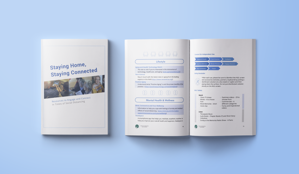
A pre-compiled guide for residents to access resources and entertainment during isolation.
My Role
I created illustrations and developed a visual theme.
Problem Point 2
How can I create documents that are both informational and aesthetically appealing?
Additional Challenges
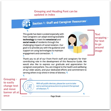
The guide had limited color and was very text-heavy with large paragraphs and long lists of info.
EDIT FLEXIBILITY
I set up grouping and text-wrapping so future edits made by team members wouldn’t break the layout.
VISUALIZING INFO
I supported heavy text with iconography and visual concepts to make important info stand out.
COLOR DIVISION
I explored variety for listed or bulleted info to add personality.
VR Viewer Major Project 3 of 3
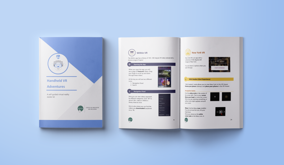
Product Info
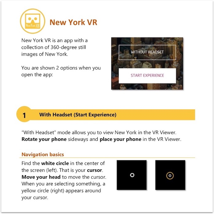
A low-cost VR viewer for residents to engage with during COVID-19. We recommended 3 main apps: WithinVR, VeerVR, and New York VR.
My Role
I created written instructions and graphics for residents to learn how to set up and use the viewer. I also worked on the document's visual design after the text was finished.
Additional Challenges
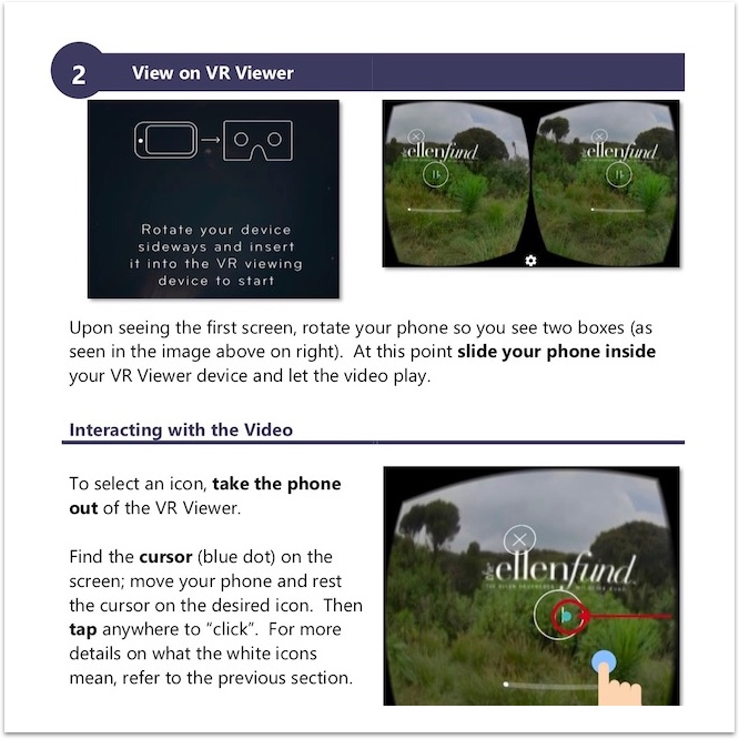
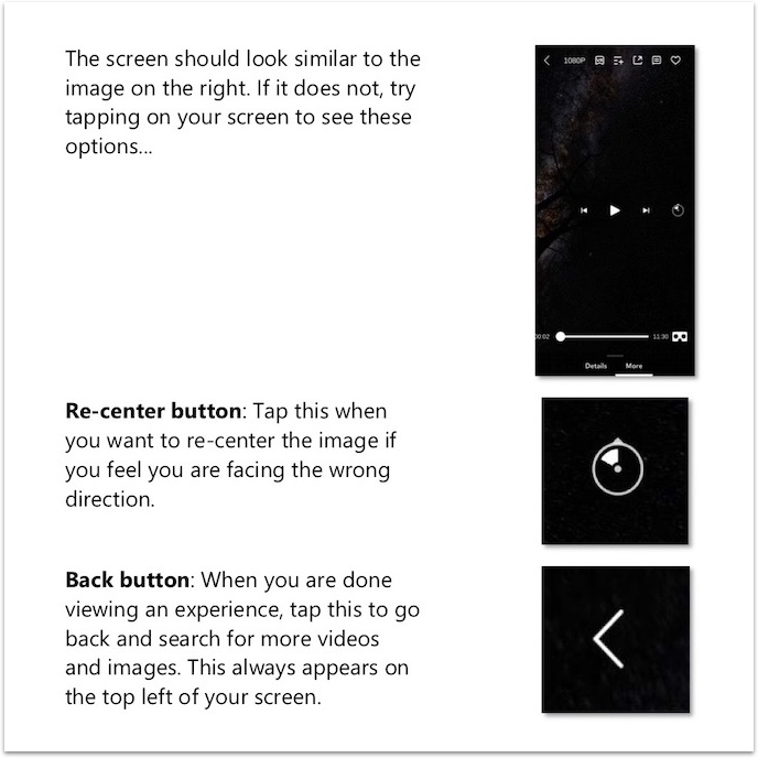
It was tricky to write about motion between a phone, a physical viewer, and the apps. There was no remote or pointer, so set up wasn't straightforward.
Problem Point 3
How can I keep in mind accessibility and different tech fluencies?
Strategies
I focused on explicitly describing gestures (rotate, drag, tap) and writing about what visual feedback a reader should expect so they know they're on the right track.
Save space
Use rows and columns where applicable
Color and division
Subtle style for an already screenshot-heavy document
Enlarge components
Helping low-vision residents make sense of busy screens
Reflection Learning Points
Challenge Assumptions
Because of differing tech backgrounds, I couldn't assume ease of use or intuitiveness. I observed that residents and staff had their own struggles or levels of understanding of these devices. Writing instructions required understanding the product myself, and its possible goals/use cases.
Constraints and Considerations
I would have loved to directly do interaction design with the vendors. I loved sitting in with the K4 Product Team and community representatives, to hear development framed around community feedback, goals, and operations. (Seeing contextual UX from my courses come into action!) If not for COVID-19, I would have participated in user testing to learn about UI elements that were pain points for older adults.
Special Thanks
I would like to thank the Front Porch organization - especially my direct supervisor, Kristle Bulleman - for the wonderful opportunity to work with the CIW team, community staff, and residents! For the future, I would love to contribute any form of design to another impactful project.