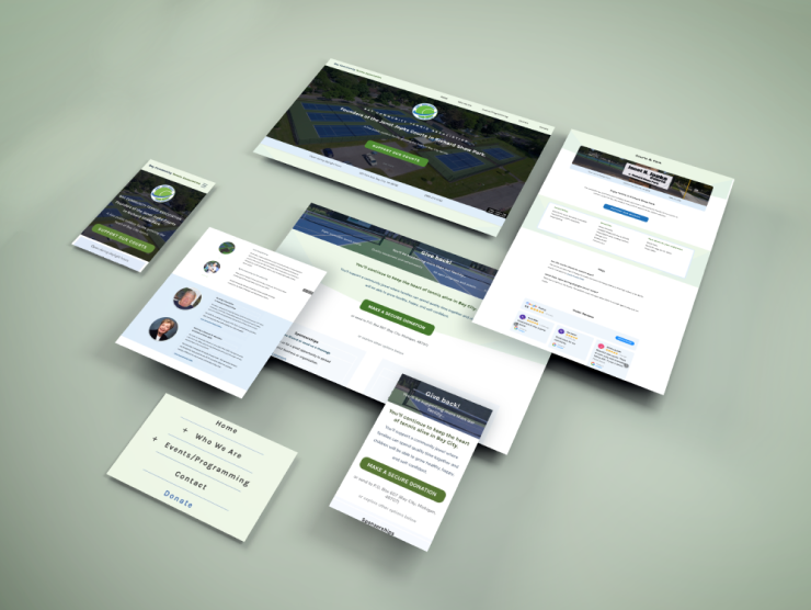
Bay Community Tennis Association
Website redesign case study
Client Overview
Bay City Tennis Association's mission is to grow tennis in the community by providing public courts and services.

"Our two main goals are to: raise awareness and raise funds." - Joe Ricard, President
The website's goal is to attract community members and donors to help maintain the facility of eight brand new courts.
PROBLEM SPACE
The site was outdated for six years with the problems:
- Contained mostly pictures and lacked informational text
- Lacked a consistent visual layout
- Lacked a distinct brand
- Not mobile responsive
SOLUTIONS
New navigation structure with improved call-to-action
SEO-friendly writing to better highlight services and story
Improved user experience (with mobile-friendly version)
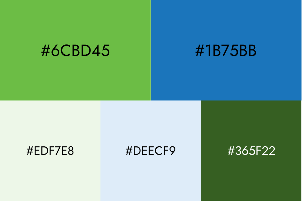
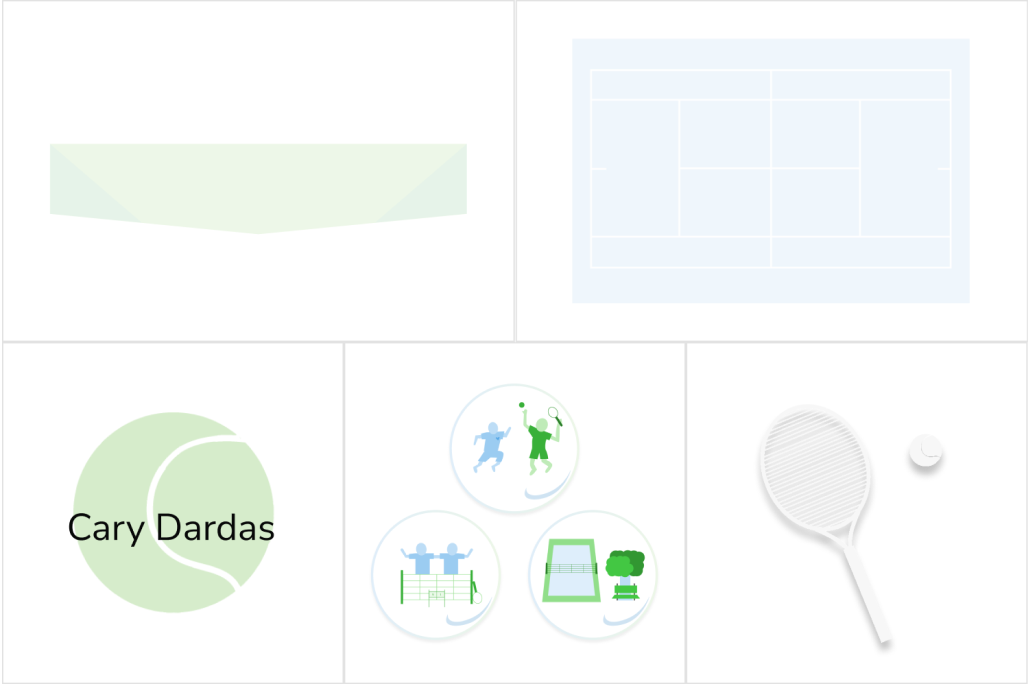
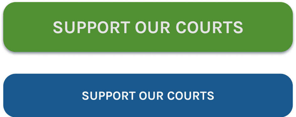
Established a visual theme from the original brand colors
RESULTS
Comparing 1 year before site launch vs. 1 year after site launch
(June 2020-2021 vs. June 2021-2022)
#1
Google Search
for tennis courts in Bay City
79%▲
site sessions
74%▲
unique visitors
Mobile responsiveness
New donation page
Project Strategy
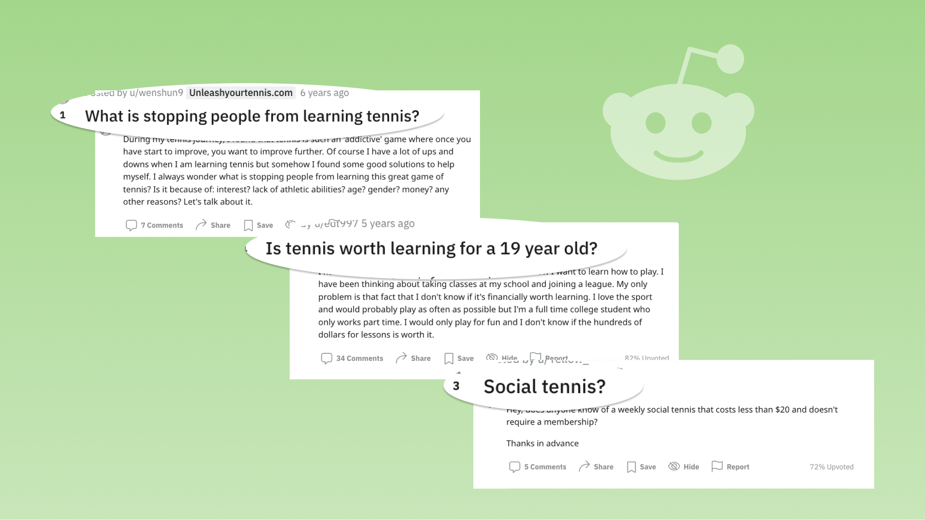
STEP 1: RESEARCH AND STRATEGY
Including SEO keyword research, competitive analysis, new sitemap creation
New sitemap creation
I incorporated the old website, existing aspects of competitors, and new requests...
..to use a bottom-up approach, resulting in 5 parent pages. (Home, Who We Are, Events/Programming, Donate, Contact)
Ideally the funnel should convert visitors to
- Donate
- Contact the organization
- Sign up for services
STEP 2: CONTENT WRITING
Including section structure and copywriting
Writing a “visual-text” document
For each page, I determined its purpose, call-to-action, and keywords to include. This guided the full writing process.
STEP 3: MID-FIDELITY PROTOTYPE
Including user testing and revisions
User testing
I gave tennis players tasks for the prototype over Zoom
- I'd like to know where the court is and what time of day I can visit
- I want to know if I should bring my own water or if there is water there
- I'd like to donate and want an idea of where my money is going
I then revised both navigation and content based on that feedback.
STEP 4: HI-FIDELITY PROTOTYPE
I applied the visual branding to the prototype and then presented it to the client. We reviewed it to ensure the intended information stood out the most.
STEP 5: WEBSITE BUILDING
Including old URL redirecting, contact form setup, and donation button linking
I built the design on the client’s existing Wix domain.
We were able to take advantage of Wix’s mobile responsiveness, but I adjusted the mobile design slightly to save scrolling space.
Content Strategy
Storytelling / Messaging
Brief History
The building of BCTA's courts was preceded by an era of court closures and declining tennis culture. Then BTCA solved this problem by launching a decade-long initiative to build the eight courts - funded by local community neighbors and contractors with the generosity of 150+ donors.
Creating a Unique Value Proposition
BCTA was built by the community, for the community.
The intent is to encourage the visitor's involvement in the community by allowing them to be part of the ongoing story.
Tone
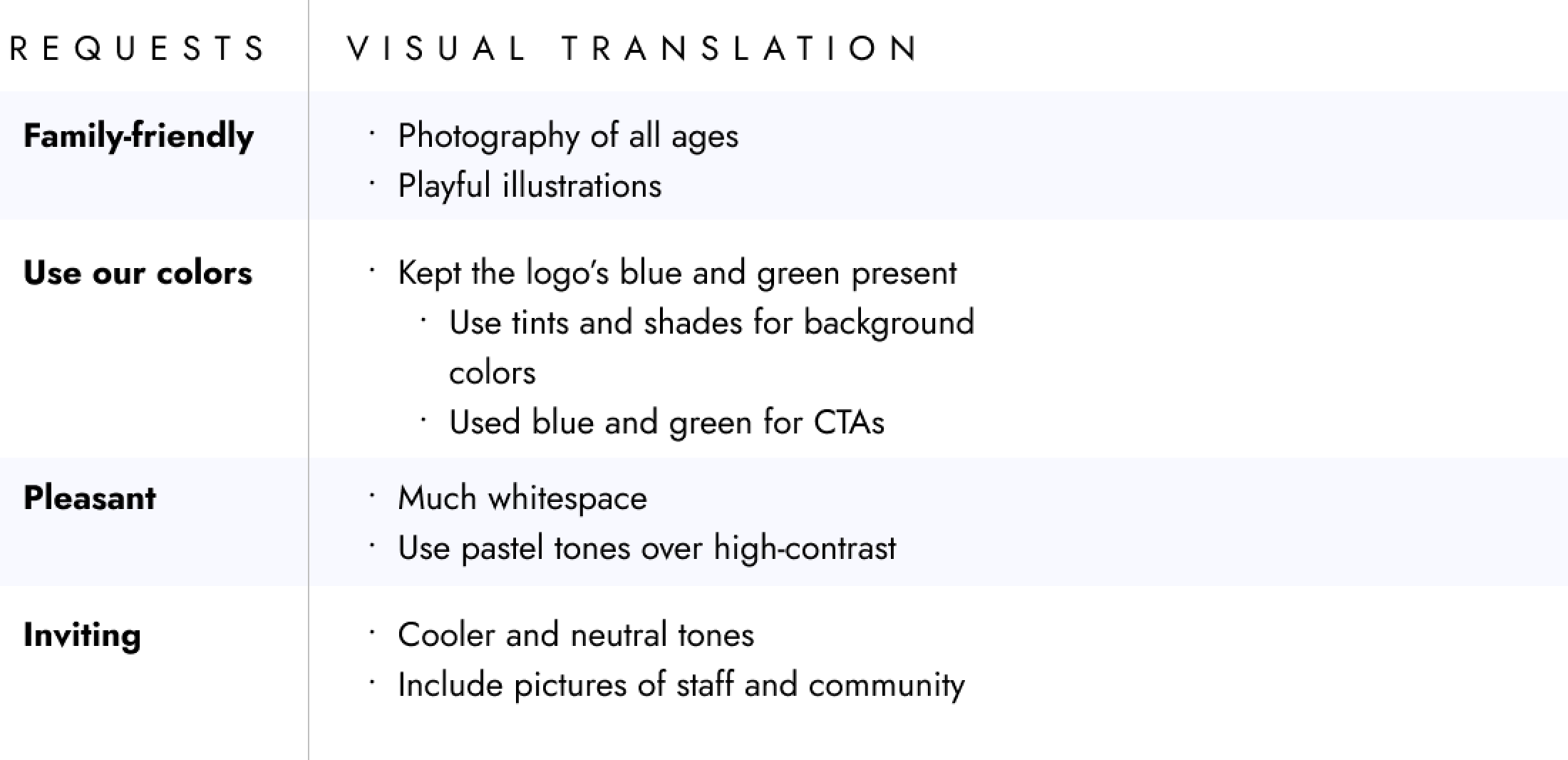
The target tone was to be: inviting
- "all ages"
- "free, public use courts"
- "recreational and competitive"
Motivations
Tone was influenced by these motivations:
- Finding friends (social benefit)
- Accessible to any skill level (low barrier to entry)
- Inexpensive, recreational activity (also low barrier to entry)
Audience Needs
Information was based on needs:
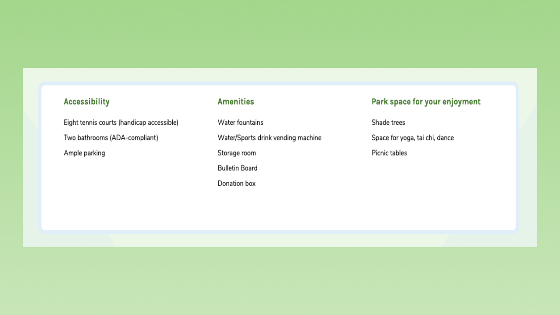
- Clear information on rules and amenities for both the courts and the park
- Learn about and sign up for programming and services
- Ways to get involved or connected
Brand Strategy
Additional Strategy
Client Maintenance
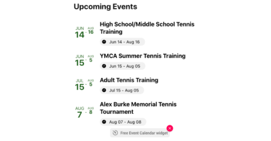
I integrated Elfsight's Event Widget so my client could easily update their events - no coding required.
Testimonials
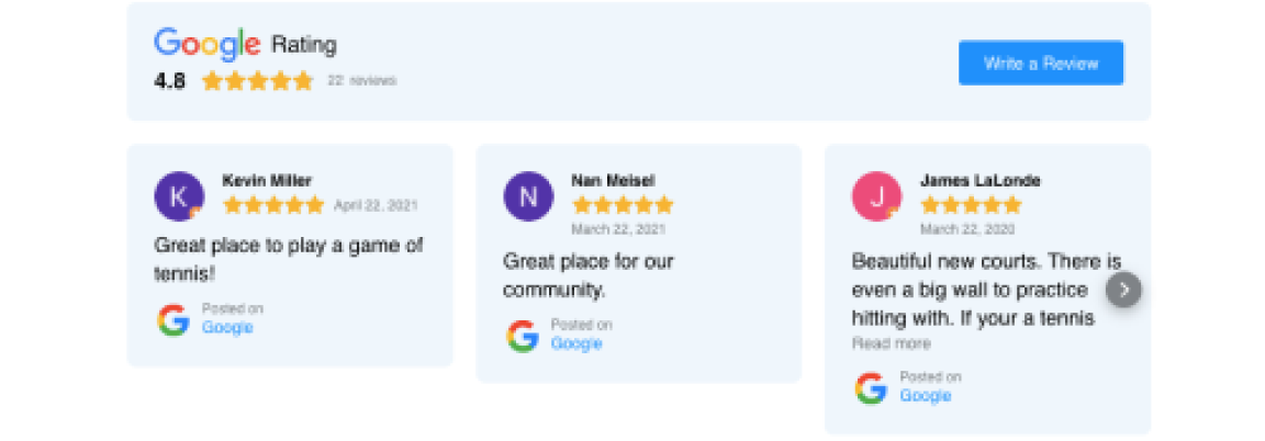
I integrated Elfsight's Google Reviews widget to highlight positive reviews and features of the courts.